
Shurity partnered with GLM Institute to build a high-conversion landing page from the ground up. We set out to build a conversion engine, custom-tailored for price-sensitive buyers in Tier 2 and Tier 3 markets.
Our goal? Create the landing page clear, credible, and urgent enabling users to move from interest to purchase without second guessing.
We focused on maximizing conversions through smart persuasion, familiar layouts, and behavior-driven design choices.
Client
GLM Institute
Scope of Work
Tier 2 & 3 Conversion Focused Landing Page
Category
Tailored Landing Page
Status
No. of Pages
The Challenge
The target audience was not typical design-savvy users.
They were:
- More familiar with offline buying behavior
- More responsive to bold, info-heavy layouts
- More influenced by proof, repetition, and urgency than minimal design
This created a fundamentally different design problem:
Our design challenge? Build something instantly trustworthy and easy to act on, even for those who aren’t used to modern web interfaces.
We intentionally chose:
- Clarity over aesthetics
- Familiarity over innovation
- Conversion over visual restraint
We stayed disciplined avoiding visual clutter .
Our Design Approach
We designed the page around one rule: “If it doesn’t drive action, it doesn’t belong.”
Instead of designing for visual appeal, we designed for behavioral response.
The page is structured to:
- Grab immediate attention
- Continuous trust building
- Repeated urgency triggers
- Frictionless decision-making
Every section played a role: build belief, kill doubt, or spark action.
The Signature System: Structured Framework
The defining move was to build a layered conversion system, not just a landing page. Each section was intentionally sequenced to guide the user from attention → trust → decision → action.
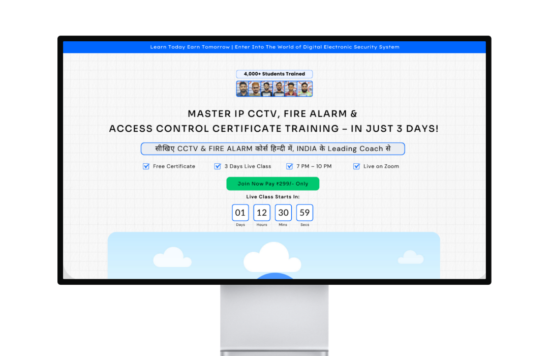
i. Attention Capture & Urgency Framing
Before users even read, the page sets the tone:
- A bold announcement bar shouts urgency
- The hero headline pops with key words
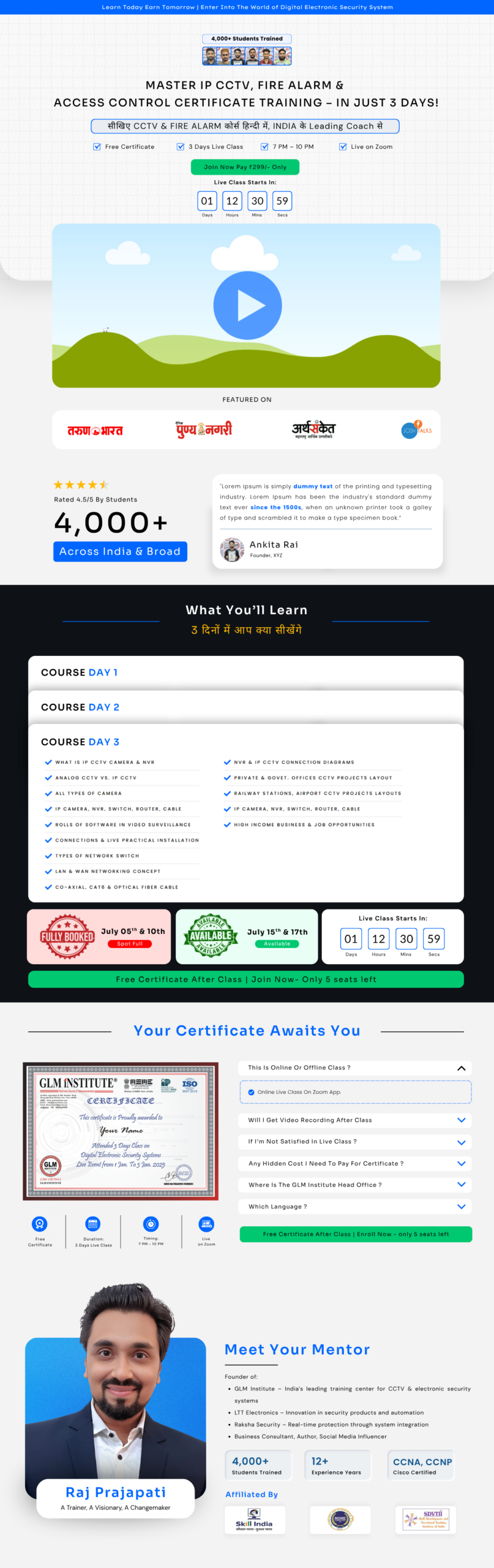
ii. Trust Acceleration Through Visual Hierarchy
We layered Trust deliberately:
- The 4,000+ student proof signals authority
- Testimonials paired with stats reinforce belief
By laying out proof early, users stop doubting and start believing.
iii. Complexity Simplified Through Structured Learning Flow
Instead of overwhelming users with course details, we introduced:
- Day-wise curriculum breakdown
- Checkmark-based learning points
This transforms complexity into digestible, achievable steps, reducing hesitation.
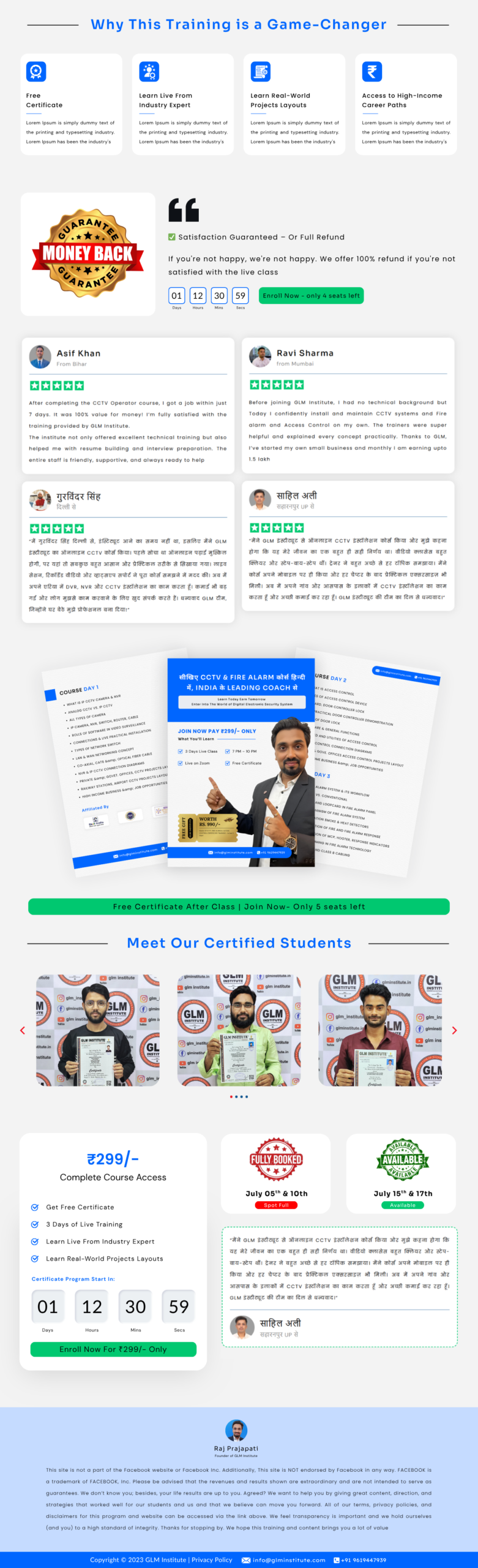
iv. Repeated Conversion Triggers (Mid-Scroll & End)
Where most landing pages stick with one CTA, we added conversion cues throughout:
- Mid-page urgency strips
- Repeated countdown timers
- Strategic CTA placements at peak attention points
This ensures users can convert at any stage of intent.
v. Authority & Outcome Boost
To eliminate doubt before purchase, we introduced:
- Certification visuals
- Mentor credibility blocks
- “Game-changer” feature grids (for quick-scan differentiation)
vi. Risk Removal & Final Push
At the key decision stage, we address hesitations directly:
- The money-back guarantee badge makes risk feel small
- Price anchor and discounts boost perceived value
- Final testimonials sit close to the CTA, combine emotion + logic
This creates a final environment where not taking action feels like the bigger loss.
The Result
- A high-converting landing page tailored to real user behavior
- Strong trust through repeated proof
- Complex course info broken down simply
- Visual flow that keeps users engaged
- Designed to convert visitors at every intent level
Conclusion
This project was about making it perform better for the right audience.
By prioritizing clarity, familiarity, and structure, Shurity built a landing experience that aligns with how users actually think, evaluate, and act.
We skipped minimalism. We ignored fleeting design trends.
Instead, we built a digital system that understands human behavior and guides it, step by step.
That’s how Shurity creates pages that attract and convert.