
Shurity partnered with Freelancers Academy with a very specific objective: To create a high-conversion digital marketing course landing page that feels dynamic, and conversion-focused from the very first scroll.
Shurity approached it more like building a high-performing educational funnel designed to:
- Grab attention instantly
- Keep people interested throughout
- Make it easy to explore courses
- Build trust over and over
- Convert cold traffic into real inquiries and enrollments
Here’s what we set out to do: Merge institute credibility, modern animated visuals, smart conversion psychology, structured information flow, continuous social proof right from the Hero section. Rather than relying on static layouts we built the entire experience around constant visual motion, rhythm, and persuasion.
Client
Freelancers Academy
Scope of Work
Conversion-Focused Landing Page Design & Development
Category
Tailored Landing Page
Status
No. of Pages
The Challenge
Most institute websites have the same structural problems:
Static Layouts
Information Overload
Weak Hierarchy
Generic Trust Badges
- Poor Engagement Pacing
Freelancers Academy required something far more strategic.
We knew the page needed to handle multiple objectives simultaneously:
Showcase Courses
Show Real Placements & Success Stories
Simplify Complex Information
Constantly Reassure Users
- Drive Inquiries Without Aggressive Popups
We had to keep visitors hooked.
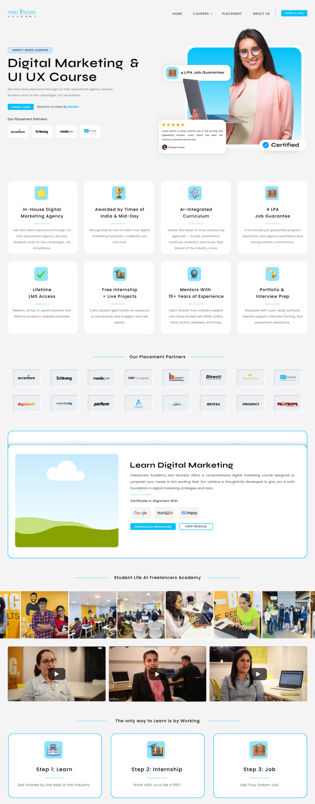
Our Design Approach
Instead of creating a static informational website, we made sure each section either builds trust, creates a bit of urgency, makes things memorable, or keeps users moving toward action.
So, we used:
Motion & Animation To Draw The Eye
Modular Layouts For Easy Scanning
Repeated Signals Of Trust And Success
CTA’s at Every Logical Point
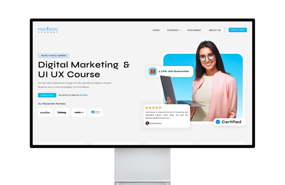
Hero Section
The hero section was intentionally designed to feel active from the very first second with:
Animated student visuals with social proof
- Recently Enrolled student names animating in
- Active placement partner carousels
- Strong CTA’s
And the hero section was intentionally designed to feel active from the very first second with
Motion Design as Engagement Psychology
One of the strongest strategic decisions across the landing page was the deliberate use of continuous motion systems.
Animating counters, scrolling strips, shifting grids, and endless workshop visuals all keep the page feeling fresh as you scroll.
Counters as Instant Authority
The counters section was strategically positioned early in the experience to build trust faster.
Modular Course Grid
Educational websites often overwhelm users with dense course information.
SHURITY intentionally solved this through modular course card systems.
Each course card acts as an independent conversion block containing:
Course Duration
- Internship Duration
- Application Deadlines
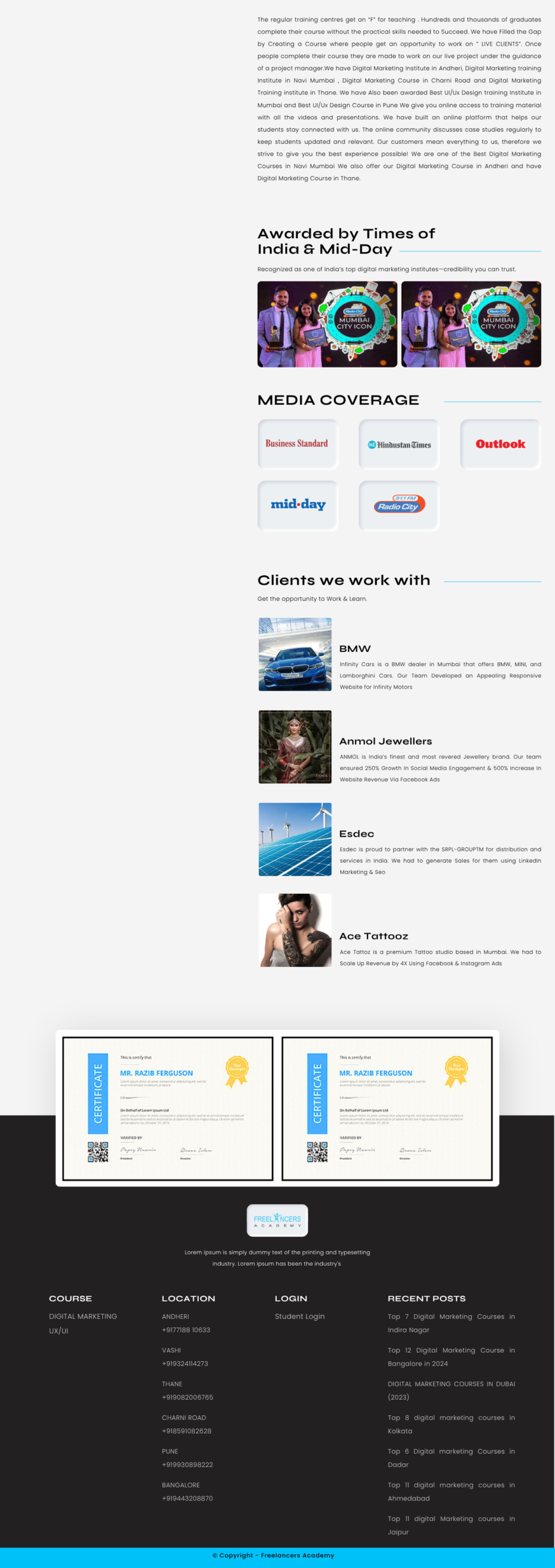
Scarcity & Urgency Sequencing
The timers across the website were intentionally placed to create a sense of urgency
Comparison Chart for Quick Decisions
The side-by-side chart spells out where Freelancers Academy shines so users don’t have to work out the differences themselves.
This dramatically reduces informational overload.
Bento Grid System
To break the visual monotony, we used an asymmetrical “bento” grid, different sized blocks, layered content, and stories told in chunks. It’s engaging to look at and keeps your eye moving
Workshop Scrolling Grid: Emotional Community Building
This infinite horizontal grid brings events, workshops, and student culture to life. You don’t just see what’s on offer, you feel what it’s like to be part of the community.
It’s proof that people are actively learning, participating, and growing here.
Layered Trust
We covered trust every way possible: written and video testimonials, company logos, student photos, social proof strips, trainer profiles. Whether you trust numbers, faces, stories, or video, you’ll find what resonates with you.
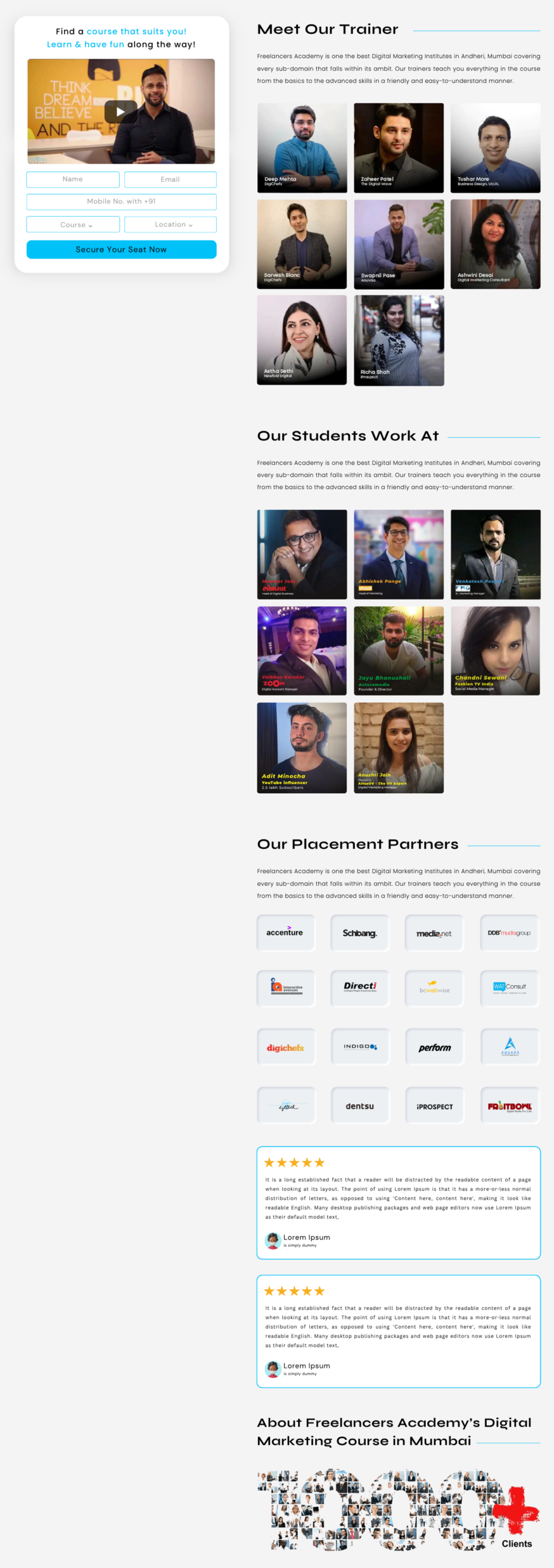
Sticky + Scrolling Content Sections
One of the most advanced UX systems across the landing page is the sticky lead form. This creates continuous conversion accessibility without relying on aggressive popups. While users scroll through:
Trainers
- Placement Partners
- Opportunities
- Social Proofs
Local SEO & Trust
The location tabs and embedded map keep things tidy and quick to find. More importantly, they emphasize that Freelancers Academy is a real, accessible place.
The Result
- A highly dynamic educational landing page that moves users forward to take action
- Motion design that locks in longer engagement
- Simplified course discovery through modular layouts
- Social proof that builds continuous trust
- A modern institute website that feels active, credible, and convincing
Conclusion
This project was to design and develop a tailored system that guides modern users, motivating them, reassuring them, and encouraging them toward action every step of the way.