
SHURITY partnered with Gourmax to optimize their product landing page for Pudina Poha Bhel.
While the brand had strong product quality and positioning in the healthy snacking segment, the product page lacked urgency triggers, structured persuasion, and conversion-focused architecture.
Our objective was clear:
Transform a standard Shopify product page into a high-converting, psychology-driven sales asset.
Client
Gourmax
Scope of Work
Conversion Rate Optimization
Category
Tailored Product Page
Status
No. of Pages
The Challenge
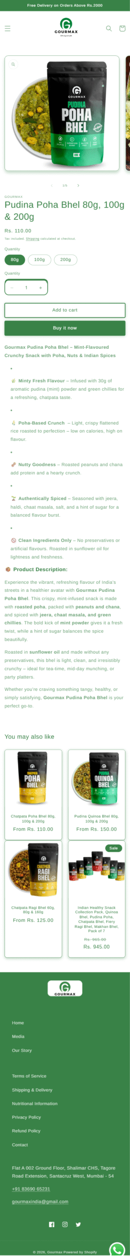
Gourmax already had a quality product - Pudina Poha Bhel, positioned in the healthy snacking category.
However, the existing product page was built on a traditional Shopify layout:
-
Standard product imagery
-
Dropdown-style variation selector
-
Static add-to-cart buttons
-
Long descriptive text blocks
While functional, it lacked persuasive structure, urgency triggers, and modern conversion mechanisms.
The opportunity was clear: Increase perceived value, reduce hesitation, and improve purchase velocity.
Our Conversion Strategy
We approached this as a CRO (Conversion Rate Optimization) overhaul, not a cosmetic redesign.
Below are the precise enhancements SHURITY implemented.
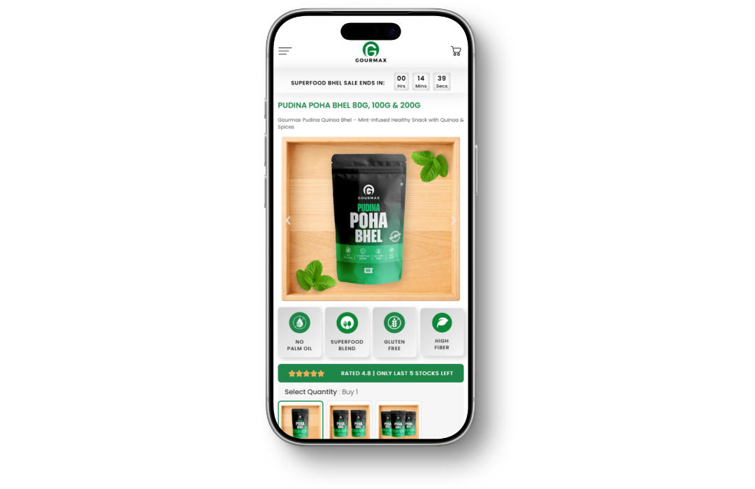
1. New Conversion-Focused Product Images
We redesigned the product visuals to:
-
Improve clarity and packaging presence
-
Highlight freshness and ingredients
-
Enhance premium perception
-
Create scroll-stopping visuals
In eCommerce, product imagery drives perceived value.
The upgraded visuals immediately elevated trust and quality perception.
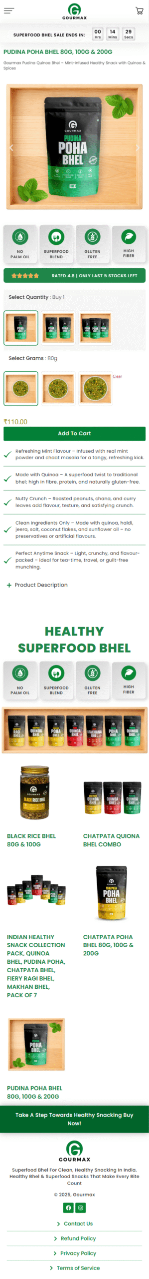
2. Urgency Timer Integration
We added a live urgency timer at the top of the product page.
Why It Works:
-
Creates time sensitivity
-
Reduces decision procrastination
-
Encourages impulse purchase behavior
-
Adds momentum to browsing sessions
Healthy snack purchases are often semi-impulse decisions. Urgency accelerates conversion.
3. USP Columns Below the Product Image
Directly below the hero section, we introduced structured USP blocks:
-
No Palm Oil
-
Superfood Blend
-
Gluten Free
-
High Fiber
Impact:
-
Instantly communicates health benefits
-
Builds trust within seconds
-
Reduces cognitive load
-
Eliminates the need to “hunt” for product advantages
Instead of reading paragraphs, users scan visual trust signals.
4. Sticky Call-To-Action (Persistent Conversion Trigger)
We implemented a sticky CTA bar that remains visible during scroll.
CTA Copy:
“Take a Step Towards Healthy Snacking – Buy Now!”
Strategic Benefits:
-
Keeps purchase action constantly accessible
-
Reduces friction on mobile devices
-
Improves conversion probability
-
Reinforces the brand’s healthy positioning
Most product pages lose conversions when CTAs disappear during scroll.
We eliminated that gap.
5. Image-Based Variation Selector (Replacing Traditional Dropdown)
This was one of the most strategic upgrades.
We replaced the conventional dropdown variation selector with image-based quantity selection.
Instead of text-based size options, users now see visual representations of:
-
Single pack
-
Multi-pack
-
Bulk options
Why This Matters:
-
Visually justifies pricing differences
-
Increases perceived quantity value
-
Improves UX clarity
-
Reduces confusion
-
Encourages higher average order value
This subtle shift improves both usability and revenue potential.
The Result
The transformed product page now:
-
Guides users instead of overwhelming them
-
Builds instant health credibility
-
Encourages faster decision-making
-
Reduces friction across devices
-
Increases perceived product value
This was not simply an aesthetic upgrade.
It was a behavior-driven conversion redesign.
Conclusion
For D2C brands like Gourmax, product pages are not information pages, they are sales environments.
By combining:
-
Strong visuals
-
Urgency psychology
-
Structured benefits
-
Persistent CTAs
-
Smarter variation UX
SHURITY turned a standard Shopify page into a conversion-optimized revenue engine.